Hillary’s tech plan: 4 more years
Hillary Clinton seems to have a real love of policy detail. Donald Trump is more of a broad-brush painter.
Nowhere are the differences between Donald Trump and Hillary Clinton more easily visible than in policy positions on their websites. If you’re just tuning in, they’re the Republican and Democratic presidential candidates.
Before I go another paragraph, understand I’m neither endorsing nor criticizing either one of them. The last thing you want, I’m guessing, is another scribbler telling you how to vote. I’ll just try to interpret what I see from them that affects federal employees and contractors.
Lots of people’s decisions will come down to which style they prefer. Hillary seems to share that real love of policy detail found in a certain type of politician, regardless of party. Donald is a broad-brush painter. If they were artists, Hillary’s signature work would be photorealistic, and Donald’s more like the Dorchester gas tank.
If you know nothing else about Clinton’s technology plans, know this: It has 49 bullet points under five categories. That should give you some idea of what policy directives would look like in a Hillary Clinton administration. Detailed. But essentially a continuation of Obama administration policies.
No doubt this cartload of apples resulted from a good deal of staff consultation with the tech company campaign donors. The campaign also includes a hyperlinked set of 17 source footnotes — plus buttons to tweet it and share in facebook.
You’ll find a lot that’s predictable — more broadband in more places with federal support, net neutrality, student aid for would-be software programmers, digital this, that and the other. Even a “civic internet of things.”
Of most interest to feds would be the nine points under “smarter and more innovative government.” Clinton would redo federal websites so they work better on tablets and smartphones. She’d continue the digital services initiative while “charging [U.S. Digital Service] with transforming and digitizing the top 25 government services” that people interact with directly. And throw in a “Yelp for government” so citizens could rate them.
Her team has done its homework. The platform includes language on fixing acquisition, buying innovative technology, putting out for data for public use, and improving cybersecurity. Paragraphs also promise to continue with challenge grants to let ordinary people help improve government, and using “technology to improve outcomes and drive government accountability. In several points Clinton explicitly reference initiatives the Obama administration has pursued.
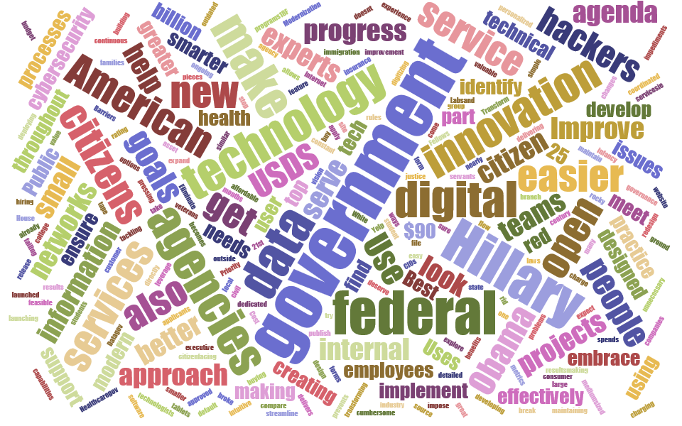
Here’s how the 1,138 words in the Clinton techno-management plan come out in a word cloud:

As of Monday morning, I could find nothing on the Trump presidential campaign site discussing federal management policy. Trump would “remove bureaucrats who only know how to kill jobs [and] replace them with experts who know how to create jobs.” There’s a section on policy for veterans that would let them go anywhere for their health needs and have the government pay, thereby forcing “VA to improve and compete if the department wants to keep receiving veterans’ health care dollars.”
In general the Trump positions that are there are less wordy and less stated in typical policy talk. But they’re also more general, breezier, and seem to talk to the average Dick and Jane who may not be concerned with or even know about federal data sets and digital services.
Imagine the race if each was capable of appealing to the other’s supporters in their own language.
Copyright © 2025 Federal News Network. All rights reserved. This website is not intended for users located within the European Economic Area.
Tom Temin is host of the Federal Drive and has been providing insight on federal technology and management issues for more than 30 years.
Follow @tteminWFED


