The DorobekInsider on DC’s NewsChannel 8 on dashboards — and the Kiviat graph
I mentioned that I was going to be on DC’s NewsChannel 8’s Federal News Tonight last night — talking dashboards, no less. (To be honest, I was a...
I mentioned that I was going to be on DC’s NewsChannel 8’s Federal News Tonight last night — talking dashboards, no less. (To be honest, I was a bit concerned the topic was a bit arcane for News Channel 8 audience, but — I also think that it is fairly innovative and that it could be quite powerful. And right at the end, anchor Beverly Kirk said it was fascinating, so… there you go!)
 You an see the video from last night here. And read the “liner notes” here — which include a photo of the initial mock-up of what the dashboard would look like as presented by federal CIO Vivek Kundra at last week’s ACT/IAC Management of Change 2009 conference. (I forgot to mention in the liner notes that this was presented at MOC literally days after it was presented to the CIOs themselves. Kundra’s speech was last Monday, June 1, and CIOs only saw the early version of the IT dashboard a few days before.)
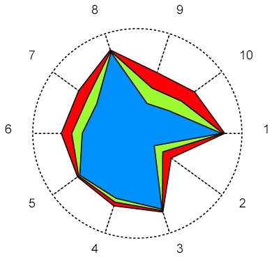
Interestingly, after posting about the dashboard, I got a note from my friend, Phil Kiviat of the consulting firm Guerra-Kiviat, who noted that the Kundra’s use of the dashboard is innovative, but that these dashboards have been evolving for a long time. (Innovation is never isolated and often the “ah ha” moment comes after years of hard work.) To that end, he suggested that I do a Googleimage search for ” kiviat graph.” In fact, Kiviat was working on dashboards back in 1973 — no, I did not key that in wrong. 1973. Back when Kiviat was the technical director for GSA’s FEDSIM, he did a circular graph — called the Kiviat graphs — to present system performance data. Here is more.
In the June, 1973 issue of the Performance Evaluation Review, the concept of using circular graphs (called Kiviat graphs by Kolence) to present system performance data was introduced in the column The Software Empiricist. In this article we wish to report on some recent work in using such graphs to present system and program profiles in a strikingly visual way of potential use to all practitioners of computer measurement. In discussing this data, we find it necessary to comment on the meaning of the variables used for such profiles in a way which also should be of interest to practitioners.
The Kiviat Graph — love it!

The Kiviat Graph
Copyright © 2025 Federal News Network. All rights reserved. This website is not intended for users located within the European Economic Area.


